By Dr. George F. Simons
NOTE: You may wish to take the "World Map Detective" quiz prior to reading the article below.
You can take the quiz again after you read the article to gauge how much you have learned.
Co-author of Cultural Detective: The Netherlands and Cultural Detective: USA
PowerPoints and handouts often clutter both the desktop and the mind. It is a situation where less might certainly be more.
Enter the map. Not the mind map, not the stakeholder map, but that humble refugee from the primary school geography class, the world map is making a comeback. It is proving itself a first class learning instrument when it comes to helping managers and employees understand the implications and demands of their increasingly diverse and globalized working environment.
Using world maps in training is not just a matter of upgrading the geographically challenged. We’ve all read media reports of the working literate who cannot find major countries on the map. Just as it has been necessary for some companies to hone employees’ insufficient language skills, it may be useful for workers to know where work and jobs are being outsourced to or where their virtual team members are located. Basic awareness of distances, time zones and climates is an essential starting point for addressing more sophisticated needs for knowledge of culture, communication styles and organizational preferences. This needs to be done before more serious faux pas erode the lines of international communication and undermine confidence in otherwise competent team members.
This is not a simple matter of restoring pride of place to the Rand McNally wall map in every class room or training room. The power of maps as training and teaching instruments has taken a quantum leap in recent years from the classic Mercator Projection that most of us avoided looking at as children. Far from being a solution, many of the maps we managed to look at then, while giving some basic information, actually contributed to our ignorance and biases about the world around us at a much deeper level.

Many maps of the world are complicit in what I like to call the “ice cream parlor deception”—the disappointment we experience when what is dished up bears scant resemblance to the scrumptious sundae pictured on the menu. Many of the traditional maps like the Mercator exaggerated the goodies for their primary consumers, the developed nations of the Northern Hemisphere, and gave us a Euro/North American centric world, exactly the problem we are trying to deal with as we train our people to “go global” and come to grips with other folks in our extended human enterprises.
The trick is to encourage the development of geographical intelligence as a standard part of the training/learning experience. This consists in the ability to read a variety of maps and know what they can tell us and what they do not—I like to call it “multi-mapping.” The distance between many maps and the reality they aim to represent—the ice cream parlor deception—may have resulted historically from a combination of ignorance, self interest, limited perspectives and in some cases even deliberate deception [1]. Looking at ancient maps, we often notice that familiar territory is highly detailed and relatively accurate while faraway places with strange sounding names were often quite lumpy and indistinct, even as more remote regions earned the name terra incognita—unknown land.
Looking into our geographical memories, we may find lumpy and indistinct maps of this sort as well, maps of our world that reflect our experience, our travels, our preferences, our biases and our ignorance. Several maps judiciously inserted into a training session can set us straight. They can provide us with some useful tools for understanding our working world, as well as fascinate us with what we didn’t know we would enjoy knowing and learning about.
The emphasis is on the “several.” Maps are in a sense like two-dimensional photographs, always true but at the same time always deceptive, because they represent a moment in time, and can only display two dimensions at a time. And even those two dimensions are not typically on a uniform scale or common unit of measure. So, training with maps requires choosing the perspectives and dimension that our trainees most need to learn about.
Let me cite a couple of examples. Sizes of countries and distances in our world are of course best represented by a globe, so attempts at creating flat maps inevitably yield distortions. The old Mercator was designed for navigation and was perfect for directions (lines of constant compass bearing). It also shows shapes somewhat accurately. However, the Mercator distorted the sizes of the land masses terribly. Since the Mercator is often the basic map in many people’s minds, it is often interesting to bring something like the Peters Projection into the training room. This map distorts shapes, but accurately represents the actual land mass sizes of countries in relationship to each other. Peters takes the bloat and gloat out of our tendency to exaggerate the importance of the Northern Hemisphere. Every map has limitations. Each one can only show certain things well, and necessarily sacrifices the others.

I have found that when a map is needed for some purpose in a training session, I often bring the Peters Projection. It serves as useful map for many purposes and exercises but is also a kind of Trojan horse in that it generally introduces a discussion about the different kinds of distortions in how we imagine and map our world.
The new Population Map, drawn by Paul Breding with an explanation by Denis Wood, offers a quantum leap in training room cartography for global and globalizing organizations as well as for government employees trying to understand the dynamics of population change and immigration [2]. It is the kind of thing I can hang on the wall and not even need to call attention to and still be assured that it will generate some very productive discussion.

What does this map do? It provides an accurate picture of the size of populations in countries around the world. It won’t help you travel from one country to another (i.e., it doesn’t have the Mercator attribute of lines of constant compass bearing), but it will show you some important information that will enable you to navigate better from the past into the future. This is a chunky map, made of little squares in which each little square represents a million people. The bigger the country looks, the bigger is its population. So you don’t need to count up the squares, the total population is printed under the name of each country that has more than 10 million people.
Most of the trainees in my programs have some sense that countries like China and India are large potential markets and they have seen population and economic statistics somewhere or other. However, I have never seen anything like this map, which turns numbers into graphics, to create a sense of meaning and urgency about how we relate to, and start to do business with, these giants. This map shows where the people are with unforgettable impact.
There are the surprises like Indonesia, almost double the size of Japan, and perhaps virtually unknown to most until hit by the devastating earthquake and tsunami at the end of 2004. Likewise Brazil—for many the land of rainforests and Ipanema—with its 186 million, and Nigeria (141 million)—seen largely as pumping oil in the forest—are also population leaders.
The Population Map also raises the question, “What does it mean if you are not on the map.” There are countries whose population size doesn’t even merit a single square of its own. On this map, whatever fame, influence or riches they have, such countries as Bahrain, Luxembourg, Monaco and the Vatican are little guys. Like Napoleon, they are exiled on this map to a spot in the South Atlantic where they are listed by name only. On maps that picture other qualities they might be much, much bigger. What would a map that indicated per capita income look like? What are the implications for large and small, rich and poor?

One of the intriguing features of The Population Map in the large wall version that I have is that below the main map it also displays seven mini-maps. There is a Hobo-Dyer Projection which, like the Peters shows the actual size of the world’s land masses, five historical population maps, from prehistoric times to mid-21st century that show where people have lived and will live, as well as one map showing the areas of densest population. Each of these is capable of producing its own aha’s, feelings and discussion.

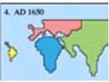

Figure 5: Where humans lived, and will be living.
These are three of the “snapshots” of human population
located by continent, on a timeline of human history.
(Not shown here are two additional images for
population figures at the Birth of Christ and for AD 1900).
Cartography is generally easy to use, as the different maps and models of reality that they present help us build a comprehensive picture and digest basic data about our world. Many stoke a desire for multi-mapping to know more. Maps “sell themselves” as solid data. While some trainees will contest the maps or their implications, or have strong feelings about their meaning, this usually leads to a productive and clarifying discussion and rarely to a rejection of the map’s message.
I have found in my own experience that maps provide a good grounding in reality for myself as a trainer. Currently I am virtually coaching about 70 humanitarian aid professionals worldwide in management and communication skills. Tracking them on a map helps be get the regional and cultural picture and offers opportunities to be aware of questions and items to discuss as the coaching progresses. Despite many years of international travel and intercultural work, maps continue to wake me up to the world I work in.
Whether introduced incidentally into the training room or deliberately used as a part of the training agenda, world maps such as Peters, the Hobo-Dyer and The Population Map add a dimension of realism and challenge to training. While many learning models seek to explain everything from team dynamics to personality types, they often compete and cause confusion when overlapping, e.g., Brain Dominance, MBTI, True Colors, and Enneagrams. This is especially true if multiple models are introduced too rapidly. Trainees experiencing “model-overload” and want to know which model is “the truth.” Each model, like each map, can only show part of the truth. And world maps, as we’ve discussed here, make that absolutely clear. To understand “the truth” we need many models, many maps, and many points-of-view.
Text © 2005 George F. Simons, www.diversophy.com
Images © 2004, 2005 www.odt.org
[1] For a fascinating overview of the triumphs and failures of mapmaking, see ISBN# 1-931057-00-1
[2] 2005. Published by and available from ODT Inc., PO Box 134, Amherst, MA, USA 01004. 1-800-736-1293, Fax: 1-413-549-3503, Int'l: 413-549-1293. , http://www.odt.org. I cite this information in full because ODT, as far as I know is the best one-stop shop for maps for training and educational purposes. The map images in this article have been provided by ODT and are used with their permission.